Embracing the Beauty of Nature: Incorporating Natural Color Palettes in Your Designs
Shafayetul Islam Pavel, PMP®, PRINCE2®, MCPS
Visionary UI/UX Designer, UX Leadership, and Design Manager | Creator of cssanimation.io and scrollyJS | Creative Explorer and Hungry for Something Different
Natural colors are inspired by elements found in nature, such as earth, sky, water, and foliage. They evoke feelings of tranquility, serenity, and connection to the environment. Integrating these hues into your designs can elicit positive emotions and foster a deeper connection with your users.
The Art of Color Palettes: Understanding the Essentials
A color palette is a carefully selected range of colors that are used in design, art, or any visual creation. It typically consists of a set of colors that complement each other and work well together to create a harmonious and visually appealing composition. Color palettes can be used in various fields, such as graphic design, web design, interior design, fashion, and more.
Color palettes are essential tools for designers as they help maintain consistency and cohesiveness in their work. They enable designers to establish a specific mood or theme, evoke emotions, and communicate effectively with their audience. A well-chosen color palette can enhance the overall visual experience and make a design more memorable and impactful.
Color palettes can be created using various methods, such as exploring nature’s hues, deriving inspiration from artwork, or using digital tools and color generators. Designers can experiment with different combinations to find the perfect set of colors that best represent their vision and convey the intended message to the viewers.
How to Use Color Palettes in Design
Color palettes are powerful tools that can greatly impact the overall look and feel of your designs. By using color palettes effectively, you can create visually appealing and cohesive designs that resonate with your audience. Here are some tips on how to make the most of color palettes in your design projects:
- Establish a Theme: Decide on the theme or mood you want to convey in your design. Whether it’s bold and vibrant or calm and soothing, choosing a theme will help guide your color palette selection.
- Limit Your Colors: Stick to a limited number of colors in your palette to maintain visual harmony. Using too many colors can make your design feel cluttered and overwhelming.
- Use Contrast: Incorporate contrasting colors to create visual interest and draw attention to key elements in your design. Contrasting colors can help create a hierarchy and guide the viewer’s eye.
- Consider Color Psychology: Understand the psychological effects of different colors and use them strategically to evoke specific emotions or feelings in your audience.
- Embrace Color Harmonies: Explore various color harmonies, such as complementary, analogous, or triadic, to create balanced and visually pleasing color combinations.
- Test Accessibility: Ensure that your color palette meets accessibility standards, making it easy for all users, including those with visual impairments, to perceive and understand your design.
- Get Inspired: Look to nature, art, or other design works for inspiration when creating your color palette. Draw from real-life color combinations that evoke the emotions or themes you want to convey.
- Use Color Tools: Utilize color palette generators and design software with built-in color features to help you select, organize, and save your chosen color combinations.
- Test and Iterate: Don’t be afraid to experiment and make adjustments to your color palette as needed. Test your design with different color combinations to see which one resonates best with your audience.
- Be Consistent: Once you’ve chosen a color palette, stick to it throughout your design to maintain consistency and reinforce your brand or message.
By using color palettes strategically, you can elevate your design projects and create visually stunning and impactful work that leaves a lasting impression on your audience.

What is a Natural Color Palette?
A natural color palette consists of colors that are inspired by the hues present in nature. It typically includes earthy tones, soft neutrals, and muted hues that evoke a sense of calmness and tranquility. Natural color palettes often draw inspiration from elements such as landscapes, plants, flowers, and minerals, creating a harmonious and organic feel in design.
The colors in a natural palette are usually soft and subdued, reflecting the soothing and timeless beauty of the natural world. Earthy browns, soft greens, warm yellows, gentle blues, and delicate pinks are commonly found in these palettes. These colors are often associated with feelings of relaxation, balance, and serenity.
Natural color palettes are popular in various design fields, including interior design, graphic design, web design, and fashion. They are particularly well-suited for projects that aim to convey a sense of authenticity, sustainability, or connection to the environment.
Incorporating a natural color palette in your designs can create a warm and inviting atmosphere, evoke a sense of nostalgia, and provide a visually pleasing experience for your audience. Whether used in a logo, website, brochure, or interior space, a natural color palette can bring a touch of nature’s beauty into your design work.
If you want to achieve a natural color palette, here are the steps you can follow:
- Draw Inspiration from Nature: Observe the world around you for inspiration. Pay attention to the colors present in landscapes, flora, and fauna. Take note of their subtleties and variations.
- Limit Your Color Choices: Keep your color palette simple and focused. Restricting the number of colors will enhance cohesion and create a more unified and natural feel.
- Use Earth Tones: Earthy colors like warm browns, soft greens, and muted blues can ground your designs and add a sense of warmth and comfort.
- Balance Warm and Cool Tones: Strike a balance between warm and cool colors to create a visually pleasing composition that mimics nature’s equilibrium.
- Consider Cultural Context: Be mindful of the cultural significance of certain colors, as they can convey different meanings across various regions.
- Test and Refine: Experiment with different combinations and gather feedback to fine-tune your palette and ensure it resonates with your target audience.
By embracing a natural color palette, you can infuse your designs with a sense of authenticity and create a memorable experience that connects with your users on a deeper level.

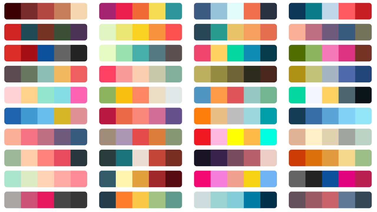
Presenting a selection of stunning natural color palettes to inspire your next design project.
The natural color palette draws inspiration from the beauty of the natural world, encompassing a wide range of colors and themes. Some popular colors and themes commonly found in a natural color palette include:
Earthy Browns and Tans: Representing the earth and soil, shades of brown and tan create a warm and grounding feel in designs.
- Brown (#A52A2A)
- Tan (#D2B48C)
- Sienna (#A0522D)
- Sandy Brown (#F4A460)

Soft Greens: Inspired by lush foliage and plants, soft greens evoke a sense of nature and tranquility.
- Sage Green (#BCCEB0)
- Moss Green (#8A9A5B)
- Mint Green (#98FB98)
- Olive Green (#808000)

Warm Yellows: Resembling the sun’s rays, warm yellows add brightness and cheerfulness to the palette.
- Gold (#FFD700)
- Goldenrod (#DAA520)
- Pale Goldenrod (#EEE8AA)
- Mustard Yellow (#FFDB58)

Delicate Blues: Reflecting the sky and water, soft blues provide a calming and serene atmosphere.
- Sky Blue (#9BE0FC)
- Baby Blue (#89CFF0)
- Powder Blue (#B0E0E6)
- Cornflower Blue (#6495ED)

Gentle Pinks: Inspired by flowers, gentle pinks add a touch of femininity and tenderness to the palette.
- Light Pink (#FFB6C1)
- Peach (#FFDAB9)
- Rose (#FF007F)
- Blush (#DE5D83)

Neutral Grays: Offering a subtle backdrop, neutral grays balance the palette and complement other colors.
- Light Gray (#D3D3D3)
- Slate Gray (#708090)
- Ash Gray (#B2BEB5)
- Charcoal Gray (#36454F)

Natural Wood Tones: Incorporating wood-inspired colors, such as rich browns, creates a connection to nature.
- Cedar Brown (#822A1A)
- Walnut Brown (#5C2E1F)
- Mahogany Brown (#4E2728)
- Oak Brown (#704214)

Organic Reds: Evoking the warmth of natural materials, organic reds add depth and energy to the palette.
- Rust Red (#B7410E)
- Terracotta (#E2725B)
- Brick Red (#CB4154)
- Coral Red (#FF4040)

Mineral-inspired Hues: Colors inspired by stones and minerals, like soft purples or warm oranges, add variety and interest.
- Amethyst Purple (#9966CC)
- Topaz Orange (#FFC87C)
- Jade Green (#00A86B)
- Amber Yellow (#FFBF00)

Feel free to download all these beautiful color palettes in a single PDF format from here
Themes that align with a natural color palette include rustic, bohemian, minimalist, and eco-friendly designs. Whether used in interior décor, branding, or digital design, the natural color palette creates a harmonious and authentic connection to the natural world, resonating with individuals seeking a calming and earthy aesthetic.
How to Use Natural Color Palettes for a Design Project
In this showcase, we’ll explore a selection of stunning designs that utilize natural color palettes to create captivating visuals across various projects. From websites and packaging to mobile apps and invitations, these examples demonstrate the versatility and aesthetic appeal of natural-inspired hues.
Whether you’re a designer seeking inspiration or someone who appreciates the beauty of the natural world, these designs will leave you inspired by the soothing, timeless elegance of natural color schemes. Let’s delve into the world of design that seamlessly blends with the wonders of nature.
Here are some examples of designs that use natural color palettes:
- Nature-inspired Website: A website for an eco-friendly resort featuring earthy browns, soft greens, and warm yellows. The design uses images of lush green landscapes, wooden textures, and sandy beaches to evoke a sense of serenity and harmony with nature.
- Organic Food Packaging: Packaging design for a line of organic food products using gentle pinks, neutral grays, and natural wood tones. The design incorporates images of fresh fruits and vegetables, giving the packaging a fresh and wholesome look.
- Wellness App Interface: An app interface for a wellness platform with delicate blues, soft greens, and organic reds. The interface features calming illustrations of nature scenes and soothing animations to create a tranquil user experience.
- Sustainable Fashion Lookbook: A lookbook for a sustainable fashion brand showcasing mineral-inspired hues and earthy tones. The lookbook uses images of models in natural settings, surrounded by rocks and plants, to highlight the brand’s commitment to eco-friendly fashion.
- Botanical Wedding Invitation: A wedding invitation design with soft greens, gentle pinks, and natural wood tones. The invitation features floral illustrations and leafy patterns, reflecting the couple’s love for nature and outdoor weddings.
- Natural Skincare Product Labels: Labels for a line of natural skincare products using earthy browns, soft greens, and neutral grays. The labels feature botanical illustrations and emphasize the use of organic ingredients.
- Outdoor Adventure App: An app designed for outdoor enthusiasts with earthy tones and warm yellows. The app includes a map feature with hiking trails and camping spots, encouraging users to explore and connect with nature.
These examples demonstrate how a natural color palette can be applied to various design projects, creating visually appealing and harmonious compositions that resonate with nature and promote a sense of well-being.
Closing Thoughts
As we reach the end of this enchanting exploration into the realm of natural color palettes, we trust that you’ve been inspired and captivated by the beauty of nature’s hues. Embrace these captivating colors and allow them to infuse your designs with an extraordinary touch.
We hope that you’ve gained valuable insights and knowledge that will enrich your future projects. May the harmony of earthy tones, vibrant greens, and serene blues guide your hand as you embark on creative journeys filled with wonder and artistry.
Incorporating natural color palettes into your designs is a transformative experience that forges a profound connection with your audience. Your creations will speak a language understood by all, painting vivid stories and emotions that transcend beyond the surface.
We invite you to apply this newfound wisdom and breathe life into your artistic endeavors, bringing the wonders of nature to life in every stroke and pixel.
Thank you for joining us on this journey through the captivating world of natural color palettes. We trust you’ve enjoyed this article and learned valuable lessons along the way. As you embark on your next project, remember to draw inspiration from the majestic landscapes and diverse flora that grace our world.
We value your feedback and invite you to share your thoughts in the comment section below. Let us know how this article has inspired you and how you plan to incorporate natural color palettes into your designs. Your insights and experiences will further enrich our creative community and inspire others to embark on their own artistic adventures.
Until we meet again, may your designs be a testament to the awe-inspiring beauty of nature and the boundless possibilities of creative expression. Happy designing!
#NaturalColorPalettes #InspiredByNature #CreativeExpression #DesignJourney #ShareYourThoughts #ColorPalettes #DesignInspiration #DesignIdeas #GraphicDesign #ColorfulDesigns #NatureInspired #TimelessElegance #BoldColors #VibrantDesigns #CalmingColors #SoothingDesigns #MinimalistDesign #CreativeDesign #DesignProject #ColorPaletteInspiration #DesignProjectIdeas #CreativeDesigners #GraphicDesigners #WebDesign #ColorfulCreativity #EyeCatchingPalettes #SophisticatedDesigns #RefinedPalettes #EnergeticPalettes #DreamyPalettes #SleekPalettes #TimelessStyle #ColorfulCreations #DesignCommunity #DesignDiscussion #DesignInspo